
Population Pyramids
March 20, 2008
The US Census Bureau provides a handy tool for viewing nations’ population pyramids. Graphs indicate the number of males and the number of females according to age. A pyramid roughly in the form of a triangle with a wide base indicates a large percentage of youths to support the elderly. It also indicates a growing population.
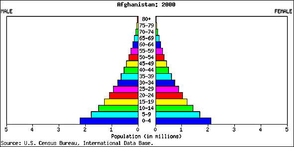
Many poor countries have pyramids in this shape. Unfortunately, poor nations can least afford dramatic increases in population. Afghanistan is a prime example, as shown in the following graph for the year 2000.
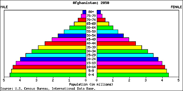
Note that the country’s projected pyramids for 2025 and 2050 indicate that growth will likely continue for decades. The CIA’s estimated 2007 fertility rate for Afghanistan is 6.64 children born per woman.

Many developed nations, on the other hand, face hardships because a drastically reduced percentage of youths will have to support a large percentage of elderly. In extreme cases, a feedback situation may develop in which the expense of caring for the elderly leaves insufficient money to afford children. If this happens, the nation may fall into an extended aging and population collapse until a severe crisis occurs. Such a trend is indicated by an inverted triangle, except for a narrowing for the most elderly — eventually we all pass on.
For an example of a nation facing that possibility, consider the following pyramids for Japan.

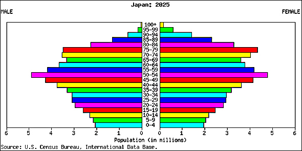
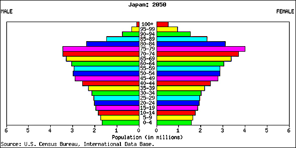
The CIA’s estimated fertility rate for Japan in 2007 is 1.23 children per woman.


